

Earlier this year, Medaptus launched our first Assign Dashboard, Hospitalist Medicine Analytics. This initial release is part of a larger vision to expand Medaptus Assign beyond the morning assignment process, enabling deeper insights, better decision-making, and greater operational efficiency for hospitalist teams.
In this blog post, we’ll walk you through the four reports featured on the dashboard and share our observations using the mock version of the dashboard, seen here.
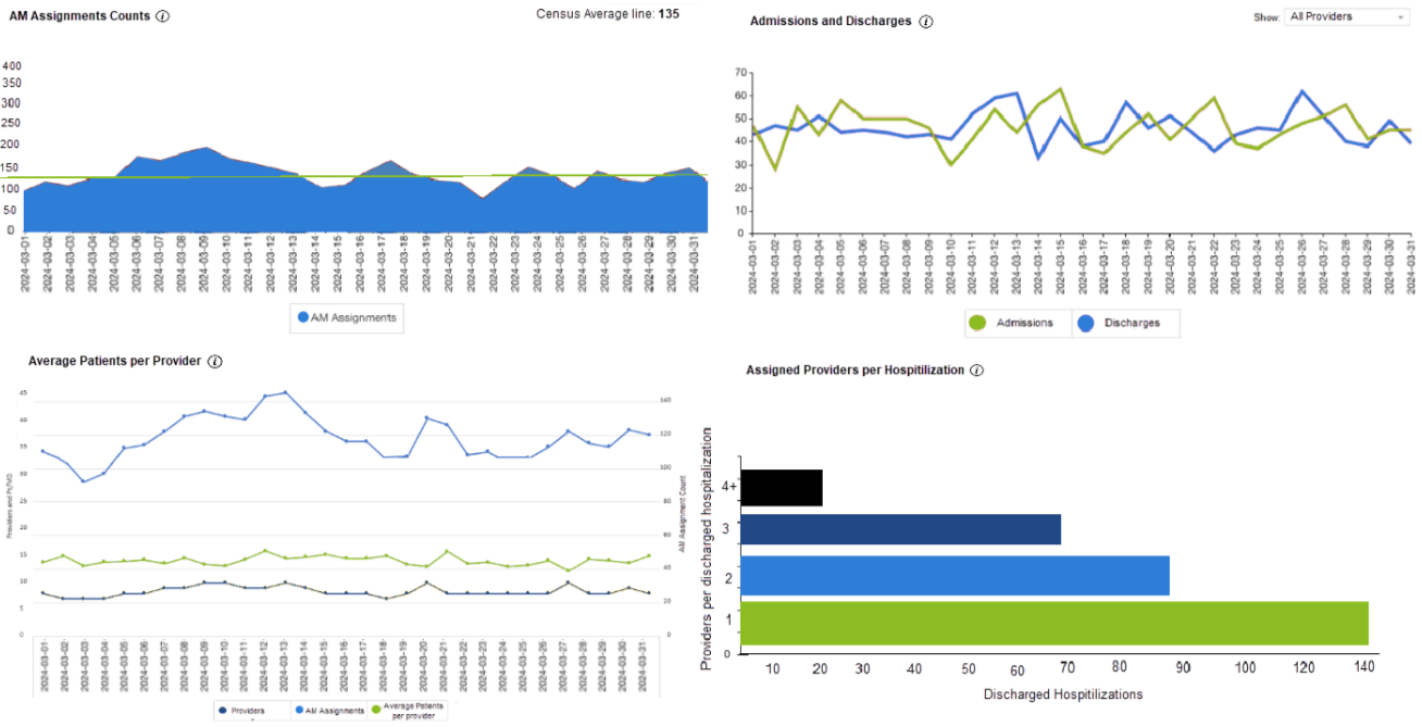
1. Morning Assignment Counts
Value: Operational monitoring and staff efficiency
- Tracks daily patient assignments to AM (morning) providers.
- The census average line provides a benchmark for normal workload levels.
- Identifies high or low census days, helping leadership anticipate staffing needs, workload distribution, and potential burnout risks.
Mock Dashboard Observations:
- Average patient census is 135 (green line)
- Patient loads fluctuated, peaking mid-month but mostly staying around or above the average. This suggests a steady but busy workload for providers.
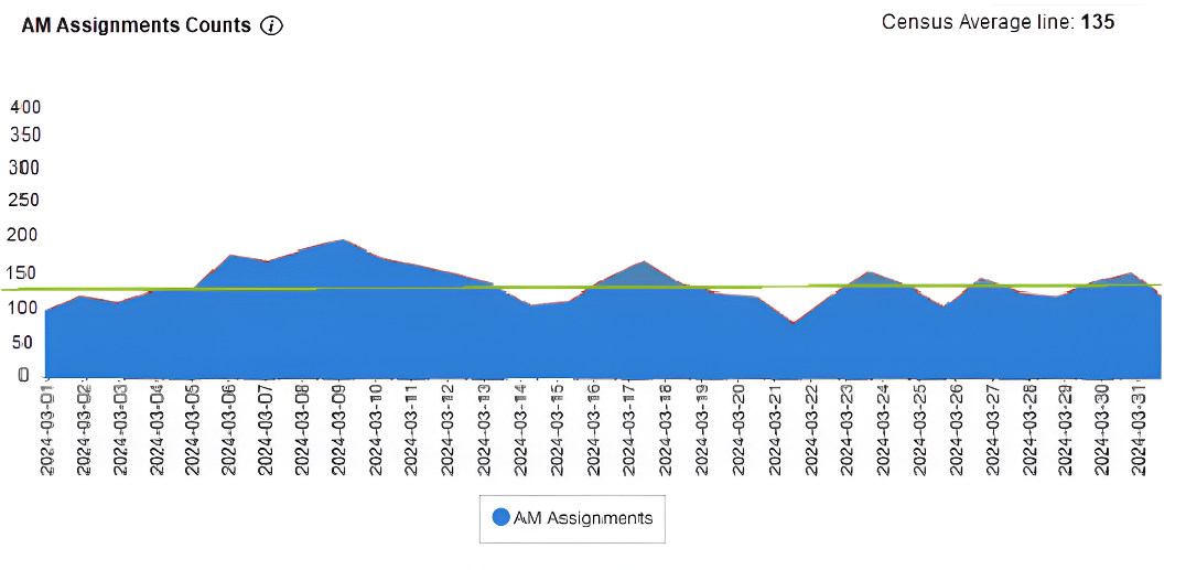
2. Admissions and Discharges
Value: Flow of patients and bed utilization
- Monitors inflow (admissions) and outflow (discharges) of patients.
- Helps identify:
- Bottlenecks (e.g., low discharges, meaning longer length of stay).
- Surges in admissions that might require temporary resource reallocation.
- Balance between admissions and discharges, crucial for hospital throughput and capacity planning.
Mock Dashboard Observations:
- The green line represents admissions, and the blue line represents discharges
- Fluctuations occur regularly, but the two lines are fairly balanced
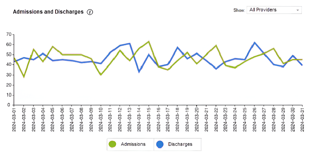
3. Average Patients Per Provider
Value: Workload management and provider optimization
- Shows the average number of patients each provider is responsible for.
- Valuable for:
- Assessing workload equity.
- Monitoring provider-to-patient ratios, which directly impact care quality and provider satisfaction.
- Identifying gaps or overutilization in staffing and scheduling.
Mock Dashboard Observations:
- Blue line shows number of providers available each day
- Green line shows total morning assignments
- Black line shows the average number of patients per provider
- Seeing an inverse relationship: when providers are fewer, average patients per provider increase
- Highs in average patients per provider may signal provider strain
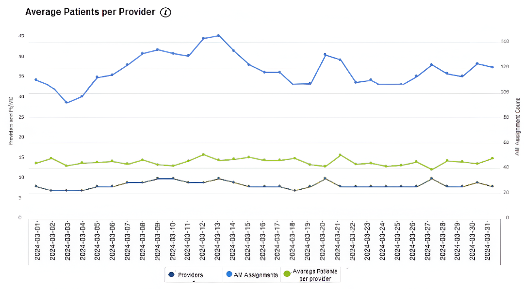
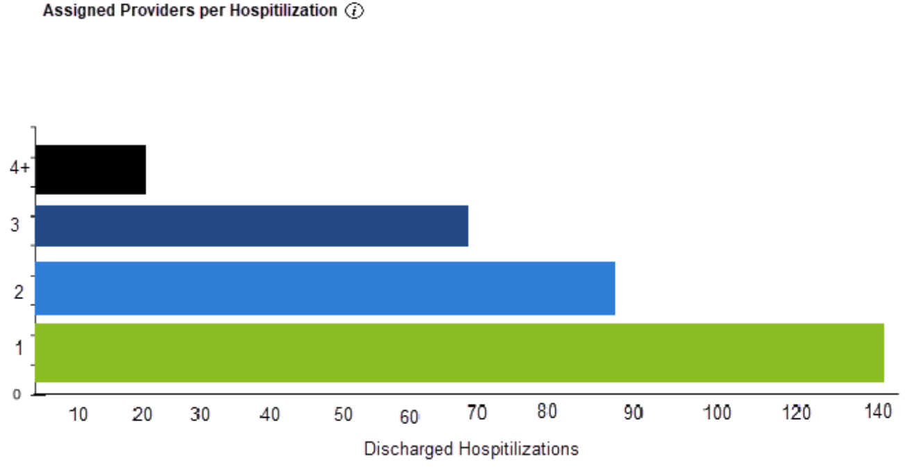
4. Assigned Providers per Hospitalization
Value: Continuity of Care and Handoff Minimization
- Highlights how many different providers managed each patient during their stay.
- High numbers (3 or more) could signal:
- Excessive handoffs increase the risk of communication errors or a lack of care coordination.
- Workflow adjustments are needed to promote provider consistency.
- High volume in the “1 provider” category suggests strong continuity of care, which is linked to better outcomes and patient satisfaction.
Mock Dashboard Observations:
- The horizontal bar chart categorizes discharged hospitalizations by the number of providers involved
- Seeing that most hospitalizations in the example (~140) involved one provider
- High continuity of care, with most patients managed by a single provider through their stay
Summary
Mock Dashboard – Summary of Findings
- Assignment Counts: Generally stable with a peak in mid-month
- Admissions/Discharges: Well-balanced overall
- Provider Load: Spikes in average patient count align with dips in provider availability
- Continuity of Care: Strong, with most hospitalizations handled by one provider
Interested in learning more about Medaptus Assign, our hospitalist medicine analytics dashboard, or the future of hospitalist medicine solutions with Medaptus?
Contact us today to schedule a demo or get more information.
Get the latest updates and news delivered to your inbox.
Subscribe to our newsletter today.